Neighborhoods
Noticeably stylized visuals, unnoticeably seamless interactions: reimagining diegetic interfaces in video games through clay, handicrafts, and found objects.
Project Info
My Role:
Design HUD, menu panels, and custom UI icons & visuals
Establish overarching color palette and flesh out game's visual direction to its interface
Implement UI assets in Unreal with source control
Manage scalable UI widgets, blueprints, and materials
Update team-wide source control to enable efficient remote work
Design Goals:
Design UI elements that evokes player curiosity and wonder from players
Ensure HUD remains visually-seamless, yet accessible to players for every gameplay need
Show Details
Overview
Reimagining what interfaces in games could look like with claymation, handicrafts, and found objects.
Neighborhoods is a cozy city sim where players help revitalize local neighborhoods through city development, business growth, residential management, and more. This city builder reimagines players' favorite local neighborhoods through cozy claymation, tactile handicrafts, and whimsical found objects.
From the start, Neighborhoods had an established visual direction, primarily utilizing clay arts and found objects in the game environment. I joined the UI Art team to establish the interface's overarching color palette and to imagine how the game's current handicrafts theming and aesthetics could be brought over to its UI as well. From hand-drawn icons to pixel-perfect textures to custom UMG shaders, I am proud to contribute to the UI design and visual styling of this imaginative (and incredibly cute!) city-fixer game.


Introducing Design Goals
Goal 1: Evoke players' sense of wonder and carry over the game's aesthetic into the UI
Generally, game interfaces should be designed to visually complement the game's world and art style. But besides simple visual cohesion, I wanted to explore how else can our interfaces also contribute to the game's worldbuilding? In other words, the world of Neighborhoods aims to evoke a sense of wonder and curiosity from its players, so how can I design our interfaces and HUD to do the same as well?
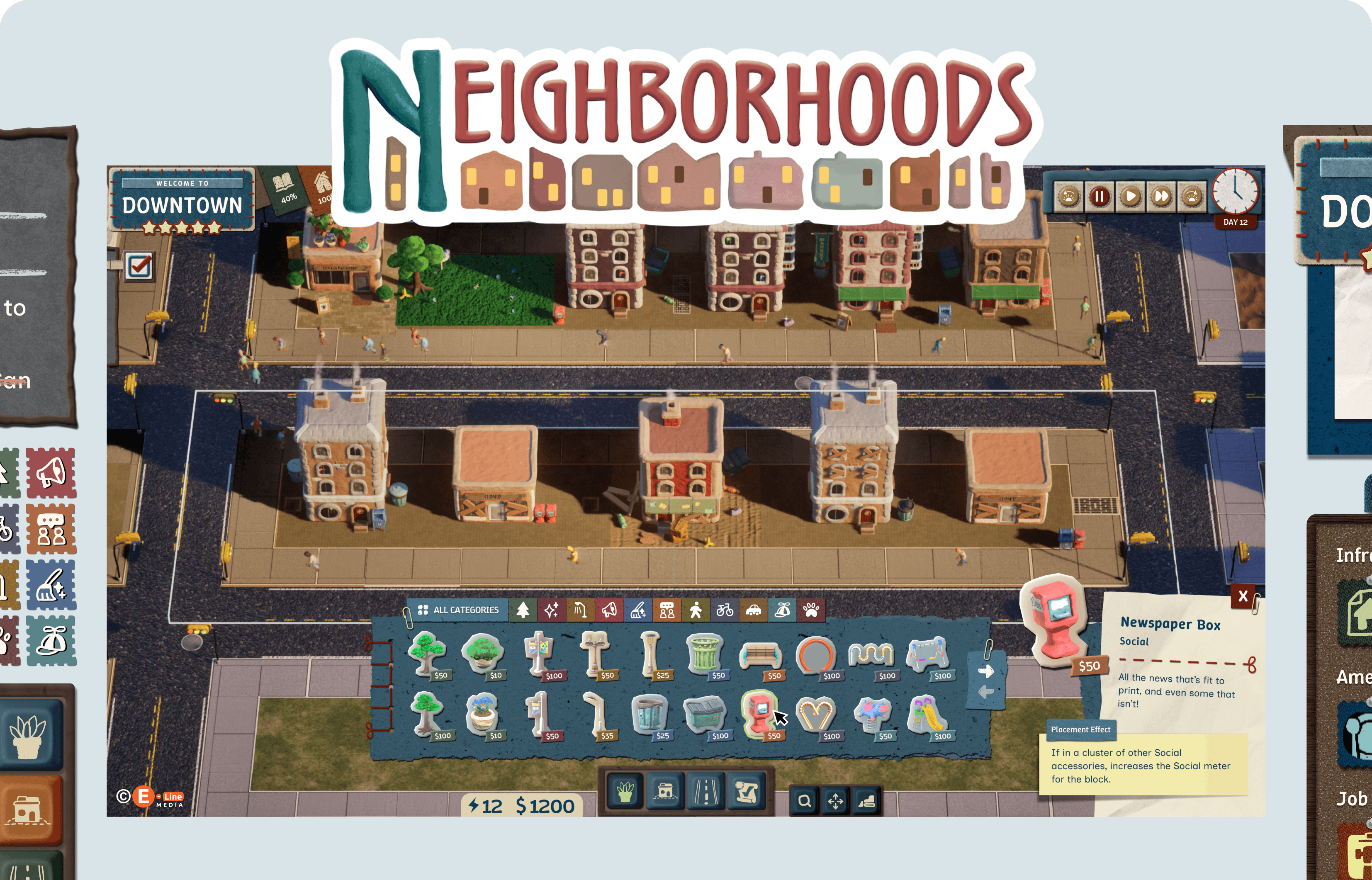
My answer to this was to make each part of the HUD look irresistably tactile in different ways, while maintaining overall visual consistency through shared materials and color palettes. This resulted in a HUD that is visually interesting to look at and explore, inviting players to try clicking on every button to see what fun interaction might happen!
HUD Before

HUD After

Goal 2: Provide players all the information they need to make choices in the most cozy, least stressful way
“But the best HUDs are the ones you barely notice, right?” To an extent, yes. But game interfaces and HUDs aren’t meant to be simply hidden! Rather, they are there to help players navigate to gameplay features or info they need. So they still need to be easily accessible at a moment’s notice, yet can also seamlessly fade into the background when the player doesn’t need it. How do we balance this somewhat paradoxical intention?
I tackled this by prioritizing what information the player needs to see in that gameplay moment and made sure that UI element is immediately recognizable at a glance. Other UI elements that aren't relevant in that moment are collapsed from view or reduced in size based on importance. At the same time, the most important information are highlighted by giving them lighter color backgrounds and/or bright yellow & red accents that naturally draw the player's eye from the rest of the interface.
Before

After

My Design Process
My 3 Guiding Lights to Designing the HUD for Neighborhoods
To keep my brainstorming and iteration process focused and productive, I came up with 3 core principles that would help ensure my UI designs would effectively help achieve the two aforementioned design goals above.
Principle 1: Determine what exactly is considered a 'found object' (and what isn't!)

Principle 2: Keep UI panels compact by minimizing unneeded empty space

Principle 3: Maintain visual cohesion by reinforcing thematic elements

Final Design Solutions
Meticulously crafting the most unnoticeable, noticeable HUD
At first thought, our two design goals may stand in opposition to each other, but I was determined to find a way to balance both clear information digestibility and 'found object' maximalism & creative whimsy. Rather than aiming to make an interface that completely disappears into the background, I focused on making sure individual HUD elements are effectively highlighted and naturally grab the player's attention in the exact moment when it's needed.
The final HUD UI was designed by combining a fixed group of approved handicrafts and desk objects. UI panels were kept compact to support information legibility and viewport clarity, while reusing major thematic elements across panels helped keep everything look cohesive as a whole. This allowed me to really push on the boundaries of what a HUD should look like, making each individual part visually interesting to stand on their own, yet still look harmonious and not visually over-bearing when put together as one HUD.


Velvety felt, smooth paper, & tactile ceramic: how to turn (almost) anything into a button!
To fully realize our 'maximalist's found object' concept, I needed to figure out how to make clickable buttons and icons recognizable, even when surrounded by many other non-interactive, yet equally visually-stimulating, elements.
I decided that regardless the color, material, or size of the interactive element, I would incorporate the major characteristics players associate with clickable UI elements—such as a large centered icon, drop shadows, loosely-square proportions, and a consistent hover state—into each of them.
By following these core guidelines, I was able to think more imaginatively beyond what a clickable button 'should' look like. Buttons don't need to just be simple squares with drop shadows or shiny pill shapes, but instead, they can designed in the form of fabric scraps, bottle caps, rubber stamps, puffy stickers, and more!


From Figma to Unreal: recreating 'realistic' 3D in 2D with scalable UMG components
One of my challenges working on the Neighborhoods UI was figuring out how to closely replicate all the detailed UI textures in UMG in the most scalable and performance-efficient way. Each UI element was crafted to look 3D diegetic, with many highlights and shadows baked into each texture to achieve this look.
So in Unreal, I created dynamic UI shader materials that would best preserve those details, regardless what tint color is applied during runtime. Custom material functions were also made to create custom drop shadows and alpha outlines for enabling hover states during runtime. Controlling parameters through dynamic material instances helped save on performance costs while keeping the UI colorful and the details crisp.
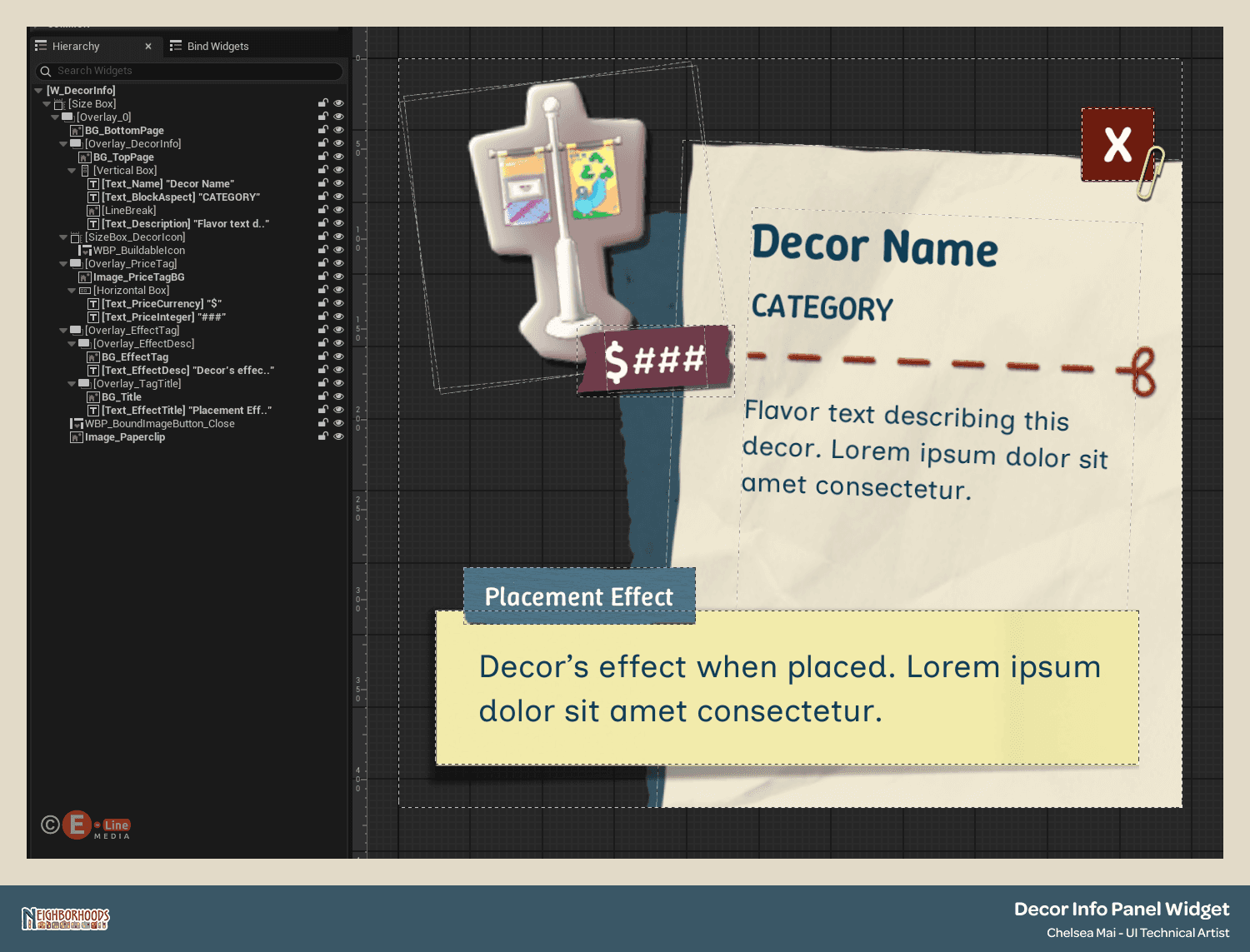
Additionally, every UI element was implemented as widget blueprints with CommonUI, ensuring consistent UI styling for reusable components like button variants, panel widgets, and icon groups for even faster UI scaling.

Takeaways
Thank you to the amazing team at E-Line Media for the chance to work on such a unique, and visually-imaginative game together! Especially to Borut for being my primary mentor, working with me to align our creative visions together and bring them to life in the lovely world of Neighborhoods (and working out the occasional bug fixes together when Unreal decides to be a little quirky *wink*). Special thanks to Tara, Collin, and Charles for all the detailed feedback and critique sessions, you each helped me smooth out the finest details and really polish these designs to be the best they could be. I greatly enjoyed working with a project and a team who appreciates creative innovation in game UI as much as I do, and I can't wait to see where Neighborhoods goes from here! <3
All Illustrations & UI Assets © Chelsea Mai. All rights reserved © E-Line Media LLC.