Gears Design System
Constructing a dedicated design system that empowers Steam to more quickly & easily design high-quality, on-brand experiences.

Project Info
My Role:
Audit Steam's current interface and conduct an inventory check of existing components and styles
Realign components that violate WCAG or create unnecessary friction in the user experience
Write design documentation outlining best use practices for each foundational element, component, and pattern
Design Goals:
Eliminate visual inconsistencies & extraneous variations of same-function elements used throughout Steam
Improve Steam's navigation & visual accessibility for users and empower Steam's designers to more easily follow suit
Establish one location for Steam's designers to quickly access and implement pre-designed components
Show Details
Overview
Now designed more swiftly & consistently than before, a modern look & feel for Steam, thanks to Gears!
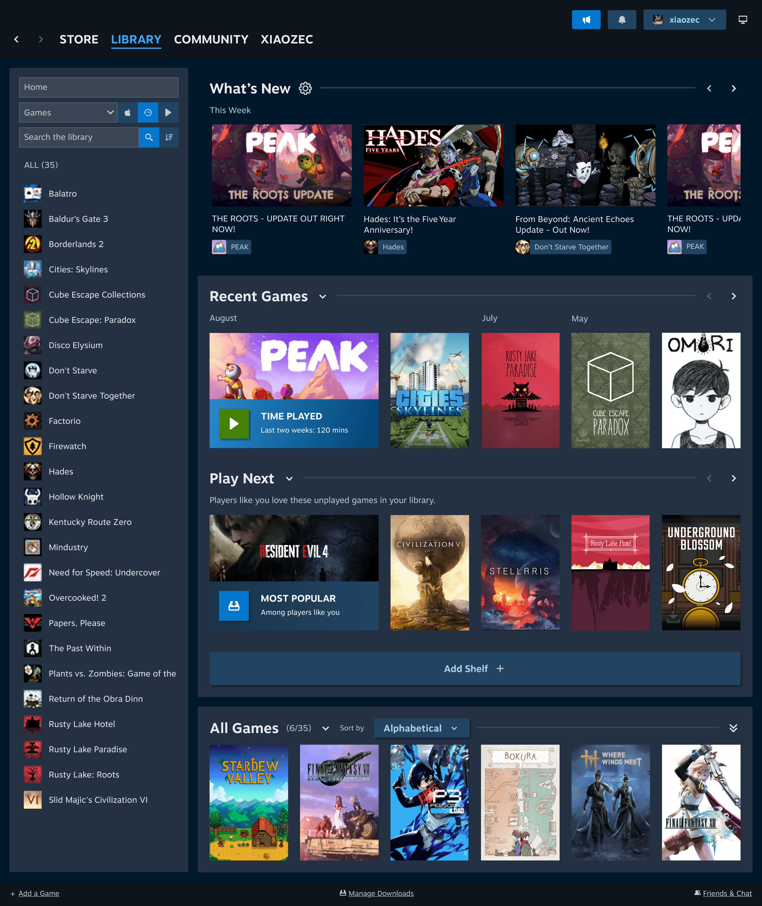
Digital gaming marketplace platform Steam lacks a consistent, site-wide design system (or at least, one that we publicly know of). Not only does this heavily slow down designers’ productivity, but also gives Steam's products an unprofessional look & feel that drives away users.
Our team created Gears, a design system fully-equipped with a library of reusable components and written documentation for implementation. Gears is dedicated to empowering Steam's designers to build a more visually-sleek and user-friendly Steam, without spending the often-massive amount of time and energy it would normally take. With foundational decisions made, visually-consistent components built, and drag-and-drop patterns ready for immediate use, Gears can turn what used to be hours of pixel-pushing into minutes of confident, professional work that reflects the "Steam-powered" experience Steam's design team promises users.
Designer A: Designing with 'Gears'
Designer B: Starting from Scratch (i.e., a blank Figma file)
At this pace, Designer B is projected to need 4 hours to finish what Designer A has created in just 12 minutes.
Problem
Steam is riddled with design inconsistencies that slow down designers' productivity!
From auditing just 2 pages from Steam, our team found 51 button styles, 54 typography styles, and 33 different colors. Without any guidelines or system, designers are overwhelmed by all these options and end up spending too much time deliberating which style is the “best fit”. Time is wasted testing each hex code or font size (in true 'trial-and-error' style), instead of using that time for more important and exciting tasks like making strategic and creative decisions for Steam's user experience.
51
types of buttons in all shapes & sizes

54
different typography styles

33
colors, each with a unique hex code
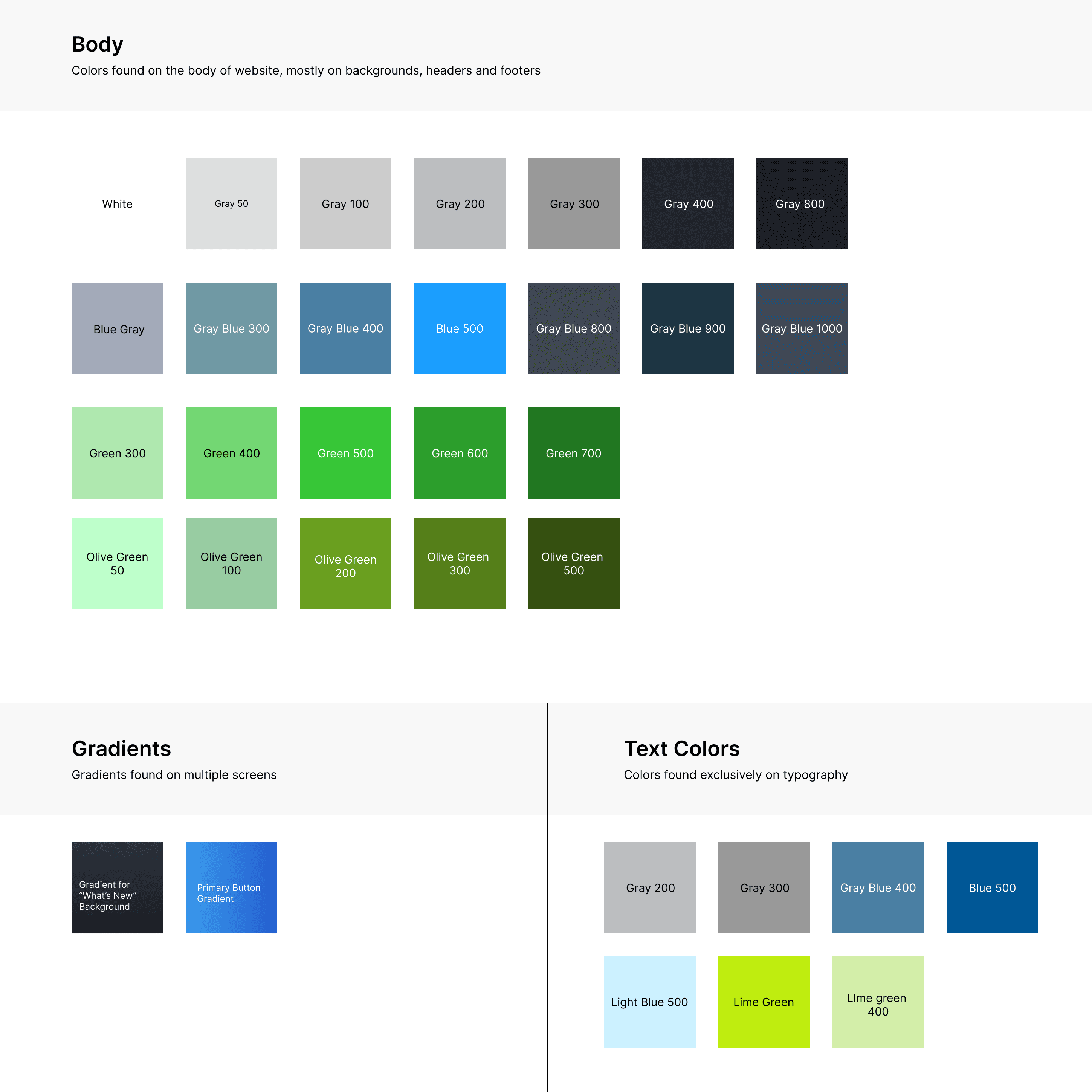
Too many buttons, typography, and color options in one platform creates more headaches than solutions!
Process & Ideation
Our Answer: A design system of reliable components, consistent visuals, and built-in accessibility, so Steam’s designers can efficiently design with confidence from start-to-finish.
Step 1: Deconstruct Steam & conduct an inventory check to see what we already have!

Step 2: Identify common-use component patterns & refine them into one UI Kit

Step 3: Document guidelines that standardize UI Kit usage & facilitate Steam-wide adoption

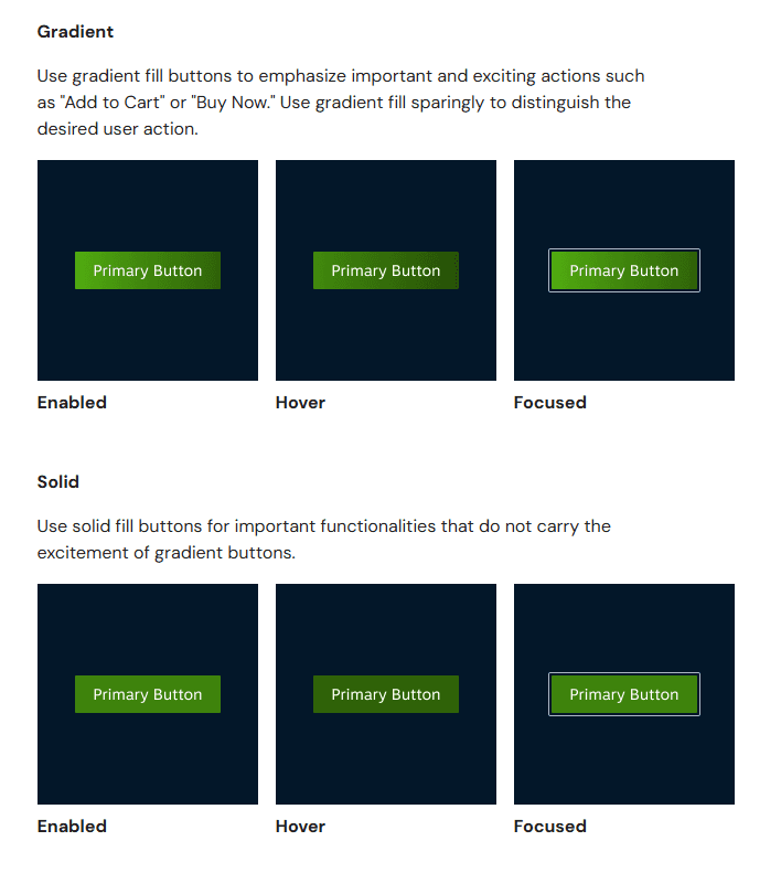
Our Solution: Core Features
A refreshed interface that embraces a more fluid & accessible user experience
While building Gears, we made revisions to existing components and patterns in order to help Steam create a more seamless experience for users. From removing extraneous information to reorganizing ambiguous labels, our team created a library of renewed components that helps users find what they need at each moment with increased clarity and ease.
In addition, we've ensured each and every component in Gears was designed with accessibility values at their core. Buttons, color, and typography combinations were meticulously chosen to uphold color-contrast and readability recommendations approved by WCAG. These foundational changes support Steam's designers to build frictionless and accessibility-friendly user experiences right from the start.


Streamlined, ready-to-use components that reinforce consistent & professional branding
We built Gears to not only help Steam feel good, but also look good! With our streamlined and on-brand components, Gears helps Steam's designers maintain the look of a sleek and professional brand without having to think twice. When users perceive Steam's designs as professional and trustworthy, they are more likely to use and return to Steam. And Gears's library of drag-and-drop components and foundational tokens makes this easier than ever. Once reassembled with Gears, it is clear how Steam now wears a more modernized look & feel that truly reflects the high-tech gaming experience it promises to deliver to users.


Accelerated design efficiency supported by authoritative usage documentation
No more second-guessing hex codes, font choices, and spacing sizes! Alongside a fully-equipped UI Kit, we also created a single source of truth for what designs should look like in the form of written documentation. These usage guidelines define clear and consistent rules for each foundational element, component, and pattern we built for Gears, reducing the learning curve new designers often face and empower them to hit the ground running during onboarding. Minimizing human error and ambiguous decision-making means Steam's designers spend less time checking specs, and more time focusing on actual problem-solving, creativity, and—of course—designing.


Final UI Kit & Documentation
Presenting: the Gears Design System!
Click below to check out our publicly available UI Kit and Design Documentation.

Conclusion & Takeaways
I Pitch, I Ponder, I Perfect(?) Gears: Takeaways & Next Steps…
Impact — We pitched our Gears Design System to a room full of hypothetical Steam designers, managers, and other internal design team members. Our goal was to convince our fellow colleagues that adopting Gears into their daily workflows is the answer to unlocking faster & easier high-quality productivity. Our pitch was met with overwhelmingly positive reception and verbal feedback that our designers would indeed like to start implementing Gears into their work.
Takeaways — While developing the story for our pitch, I really had to think about the differences of pitching a product (in our case: Gears) vs. merely presenting about it. I found that imagining myself from the perspective of a designer in the audience (e.g. if I were sitting in the audience and listening to somebody pitch their design system to me) and thinking, "What would make me care about bringing another person's design system into the way I normally design?". My answer to that was showing hard numbered data (in our case, a running timer) so that our audience can see with their own eyes that Gears truly does improve design-work efficiency. Using this same line of thinking to determine what other kinds of stories I want to tell for pitching for my projects in the future will prove immensely helpful, as somebody who doesn't want to be just simply a designer, but eventually a forefront innovator as well.
Next Steps — The Store and Library pages we started building Gears based off are only a few of many different pages across Steam's platform. To further construct Gears, my next steps would be to expand into other pages found in Steam's Store and Library tabs using the same process described earlier: auditing current interfaces, consolidating repetitive components into a simplified UI kit, and writing best-use design guidelines. Since components and foundational tokens in Gears were already built to be reusable, it's likely that many of the elements on these additional pages can already be rebuilt with them, creating variants where absolutely needed. As for what's currently in Gears, regular maintenance of existing components is essential. We set up methods for accepting contribution submissions or bug reports from any internal team member to help with improving the design system and with creating a community of designers who work, live, and breathe Gears!
Thank you to my Team Fig.4 members: Nallely, Rutuja, and Sophia for working together with me to bring this design system to life! Special thank you to Craig MacDonald for your guidance throughout the duration of this project. :)